


Why nobody respects Bleacher Report
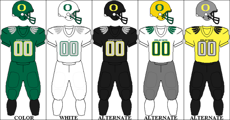
People nowadays send me anything to do with uniforms, what with the various bones I've picked over my 37 years on the internet. The truth is, the Oregon Ducks won. It turns out a wildly changing uniform and stupid looking epaulets are what it takes to attract short sighted college bound athletes. Some schools, like, say, Alabama and Purdue thrive on tradition, and believe that uniforms should be, you know, uniform. Now that you've gotten off my lawn, let's talk about this.

This is a couple months old, but a writer and Bleacher Report ran some fan created, hypothetical Nike Pro combat uniforms for the NFL. They were.... well... For example, here is the Vikings look:

So yeah, they're pretty awful. I could have linked to a number of different places with these monstrosities, but instead I wanted to point you to Bleacher Report because of the unabashed support for almost all of the new looks. Below are all the comments for these jerseys, with comments from me, where I feel they are warranted.
Dolphins - This design keeps the flamboyant colors that Miami is often associated with, but at the same time is able to make it somewhat fearsome.
Patriots - A nice job of incorporating the patriotic theme into the jersey. The American flag on the sides is an insane touch that makes this jersey pop out. (Maybe the most offensive of the bunch, tearing up the American flag like that. It looks like an AFL team)
Jets - It's amazing how adding black to a jersey can make it so much more intimidating. (One of the few looks I personally like)
Broncos - Using their throwback logo, this Broncos uniform changes things up tremendously. Tim Tebow will rep it well. (Nice work, fitting in a Tebow reference)
Chiefs - Not much to do to make the McDonald's-like color scheme of the Chiefs look appealing, but this design does indeed make it somewhat better. The choice of a more vibrant yellow adds a little more zing. (Dude loves yellow. Stay tuned for more)
Raiders - The color scheme chosen by Al Davis is always one which provokes fear. With this new design it looks even more scary than it does today.
Chargers - Like the Chiefs, this design uses a more vibrant yellow, allowing for a much more amazing design. (Vibrant yellow)
Ravens - The black shoulders combined with the purple makes this one of the most intimidating jerseys of the potential release.
Bengals - Dang. The tiger design is absolutely, positively, undeniably incredible. (The pants look like Zubaz. I deny the tiger design is incredible)
Browns - Poor Cleveland Browns can't catch a break anywhere. (Actually, the Browns caught a lucky break, because they had no changes to their uniforms)
Steelers - What's impressive about this design is how the red and blue from the old helmet is incorporated into the sleeve. (So impressive)
Texans - With such an extravagant jersey today, there is surprisingly nothing too impressive about this one. (When I think Houston Texans, I think extravagence, but that's mostly because Houston is such a cosmopolitan city)
Colts - Not too much of a change for the Colts' uniform. Hopefully their record will have a bigger change. (Zing!)
Jaguars - I don't know how I feel about the leopard design. (The first of the truly modified jerseys he didn't like. And also, I assume that is a Jaguar design, what with the team being the Jacksonville Jaguars and all)
Titans - In my opinion, the Titans currently have one of the worst uniforms in the NFL, but this new design does everything to incredibly upgrade the Titans' uniform. (The helmet was cool. What? I can't be negative all the time)
Cowboys - Its amazing just how turning the white into dark grey can make a uniform look so much better. (There was no change to the uniform. He is just color blind, or doesn't understand shadows, or that the Cowboys wear gray already.)
Giants - The additions of the black and red add to a pretty boring design.
Eagles - Similar to the feathers on the Oregon Ducks' uniform, the addition of the Eagle feathers on the shoulder makes this jersey look unbelievable. (I agree with unbelievable, but I assume he means something different)
Redskins - That helmet is such an increase from the current one. The additions of feathers on uniforms make them seem so much more realistic. (No opinion on the uniform itself, but I do have to question who taught this guy English. It reads like spam from Hong Kong)
Bears - The blue and black background makes the orange pop out, adding a little more fire than what we see today. (Chicago Bears, historic, venerated uniforms. Need more pop)
Vikings - I am simply loving the bright yellows that are being used. Also look at the horns on the sleeves. (Bright yellows)
Saints - Similar look, but the addition of the gold on the shoulders makes this design even more amazing. 49ers - Similar look, still impressive. (Actually, completely different look, looks terrible)
Falcons - Again, the darkness adds intimidation. (Agreed. Intimidating)
Panthers - Personally, I like the current ones better, but these are still pretty amazing. (He likes TEAL better than black. I actually think these Panthers mockups are pretty sweet.)
Rams - Not extremely different, but the uniform still keeps the intimidation factor. Now, if only the Rams were actually intimidating...(zing!)
Seahawks - Loving the neon green as the secondary color. I hope there will be an even cooler alternate jersey with the neon green as the base.(This is exactly the same, which leads me to believe that the Seahawks are already using Pro Combat. And the Seahaks DID use a neon green alternate. It made a nation weep tears of blood)
Bills - Very similar—nothing much to say.
Cardinals - This one can go either way; a handful of people will love this, while others will vomit from it. Lions - I would think Nike would try to incorporate the mane of a lion into this design somehow—guess not.(I would love to see the Lions wearing fur coats. Also, I am sure it is just an artistic error, but the Lion mascot on the helmet is pointed in the wrong direction, so the Lion can poop in the eyes of the wearer.)
Buccaneers - I love the use of the throwback logo; a good look for Tampa. (Hey, one last one we agree on)
So of a total of 31 teams (the Packers weren't included) he was positive about 25 of them. In fact, he said 4 of them were "intimidating" and 5 of them to be "amazing" This is what we are fighting against in trying to prevent eyesores from becoming prevalent in the NFL. And it lurks at Bleacher Report
Patriots - A nice job of incorporating the patriotic theme into the jersey. The American flag on the sides is an insane touch that makes this jersey pop out. (Maybe the most offensive of the bunch, tearing up the American flag like that. It looks like an AFL team)
Jets - It's amazing how adding black to a jersey can make it so much more intimidating. (One of the few looks I personally like)
Broncos - Using their throwback logo, this Broncos uniform changes things up tremendously. Tim Tebow will rep it well. (Nice work, fitting in a Tebow reference)
Chiefs - Not much to do to make the McDonald's-like color scheme of the Chiefs look appealing, but this design does indeed make it somewhat better. The choice of a more vibrant yellow adds a little more zing. (Dude loves yellow. Stay tuned for more)
Raiders - The color scheme chosen by Al Davis is always one which provokes fear. With this new design it looks even more scary than it does today.
Chargers - Like the Chiefs, this design uses a more vibrant yellow, allowing for a much more amazing design. (Vibrant yellow)
Ravens - The black shoulders combined with the purple makes this one of the most intimidating jerseys of the potential release.
Bengals - Dang. The tiger design is absolutely, positively, undeniably incredible. (The pants look like Zubaz. I deny the tiger design is incredible)
Browns - Poor Cleveland Browns can't catch a break anywhere. (Actually, the Browns caught a lucky break, because they had no changes to their uniforms)
Steelers - What's impressive about this design is how the red and blue from the old helmet is incorporated into the sleeve. (So impressive)
Texans - With such an extravagant jersey today, there is surprisingly nothing too impressive about this one. (When I think Houston Texans, I think extravagence, but that's mostly because Houston is such a cosmopolitan city)
Colts - Not too much of a change for the Colts' uniform. Hopefully their record will have a bigger change. (Zing!)
Jaguars - I don't know how I feel about the leopard design. (The first of the truly modified jerseys he didn't like. And also, I assume that is a Jaguar design, what with the team being the Jacksonville Jaguars and all)
Titans - In my opinion, the Titans currently have one of the worst uniforms in the NFL, but this new design does everything to incredibly upgrade the Titans' uniform. (The helmet was cool. What? I can't be negative all the time)
Cowboys - Its amazing just how turning the white into dark grey can make a uniform look so much better. (There was no change to the uniform. He is just color blind, or doesn't understand shadows, or that the Cowboys wear gray already.)
Giants - The additions of the black and red add to a pretty boring design.
Eagles - Similar to the feathers on the Oregon Ducks' uniform, the addition of the Eagle feathers on the shoulder makes this jersey look unbelievable. (I agree with unbelievable, but I assume he means something different)
Redskins - That helmet is such an increase from the current one. The additions of feathers on uniforms make them seem so much more realistic. (No opinion on the uniform itself, but I do have to question who taught this guy English. It reads like spam from Hong Kong)
Bears - The blue and black background makes the orange pop out, adding a little more fire than what we see today. (Chicago Bears, historic, venerated uniforms. Need more pop)
Vikings - I am simply loving the bright yellows that are being used. Also look at the horns on the sleeves. (Bright yellows)
Saints - Similar look, but the addition of the gold on the shoulders makes this design even more amazing. 49ers - Similar look, still impressive. (Actually, completely different look, looks terrible)
Falcons - Again, the darkness adds intimidation. (Agreed. Intimidating)
Panthers - Personally, I like the current ones better, but these are still pretty amazing. (He likes TEAL better than black. I actually think these Panthers mockups are pretty sweet.)
Rams - Not extremely different, but the uniform still keeps the intimidation factor. Now, if only the Rams were actually intimidating...(zing!)
Seahawks - Loving the neon green as the secondary color. I hope there will be an even cooler alternate jersey with the neon green as the base.(This is exactly the same, which leads me to believe that the Seahawks are already using Pro Combat. And the Seahaks DID use a neon green alternate. It made a nation weep tears of blood)
Bills - Very similar—nothing much to say.
Cardinals - This one can go either way; a handful of people will love this, while others will vomit from it. Lions - I would think Nike would try to incorporate the mane of a lion into this design somehow—guess not.(I would love to see the Lions wearing fur coats. Also, I am sure it is just an artistic error, but the Lion mascot on the helmet is pointed in the wrong direction, so the Lion can poop in the eyes of the wearer.)
Buccaneers - I love the use of the throwback logo; a good look for Tampa. (Hey, one last one we agree on)
So of a total of 31 teams (the Packers weren't included) he was positive about 25 of them. In fact, he said 4 of them were "intimidating" and 5 of them to be "amazing" This is what we are fighting against in trying to prevent eyesores from becoming prevalent in the NFL. And it lurks at Bleacher Report
Labels: Bleacher Report, NFL, Ugly Ugly Uniforms
posted by Ryan | 7:01 PM
|
0 comments